How exposed is your occupation to COVID-19?
Does your job place you at greater risk of COVID-19? Is it safe for you to go back to work? These are just some of the questions many of us are beginning to ask ourselves as restrictions begin to ease around the country.
Infographic summary
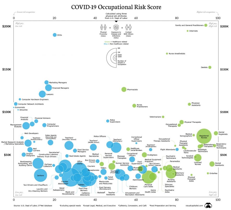
‘Visual Capitalist’ is an American-based team who aim to ‘create and curate enriched visual content focused on emerging trend in business and investing’ have created an infographic on which occupations face the highest levels of exposure to COVID-19 (more information here). The infographic displays the ‘risk scores’ that were assigned to 966 occupations, a score ranging from 0 to 100 measuring their respective exposure levels to COVID-19. The score was based on three factors:
- Extent to which contact with others is required in order to perform the job
- Time that job requires workers to perform tasks in close physical proximity to others
- How often the job exposes workers to hazardous conditions, in particular to diseases and infection
The majority of the findings were as expected, with occupations such as paramedics and dentists having significantly higher exposure to COVID-19 than economists and yes, actuaries. Actuaries were given a risk score of 5.2, the 16th lowest out of the 966 occupations. This is significantly lower than the average score of 30.2, which can be attributed to actuaries not having to work in close proximity to others as well as being able to more easily work from home.

Possible improvements
Although a big risk of the pandemic is contracting the disease itself, clearly the economic impacts are far-reaching, extending beyond those who get sick. The infographic could be extended to include the financial impact of COVID-19. This would be achieved by including a measure for the unemployment rate within a job and sensitivity factor based on the average income of the job i.e. a person in a job earning in the bottom quintile of the average Australian’s income will have a higher factor than a person in the top quintile.
This would provide a more holistic approach to assessing the impact of COVID-19, both on health and financial wellbeing. For example, hospitality has been one of the industries in Australia hit the hardest by the pandemic with 270,000 jobs lost and over 120,000 workers stood down. Another notable example is Australian airlines, Qantas and Virgin, standing down a combined 28,000 workers amid travel restrictions.
Whilst the current infographic suggests a worker in hospitality such as waiter or waitress has a risk score of 43.6, taking into account the significant reduction in jobs and typical income of about $55,000 AUD, below the average full-time earnings of about $85,000, would generate a higher “impact” score.
The new infographic would be three-dimensional, using the original two axes, annual income and risk score and include a new axis for the impact score, creating “risk surfaces” in the 3-dimensional plane. This would allow the relationship between income, health impact and financial impact to be viewed and provide a more holistic representation of the impact of COVID-19 on each of the measured occupations.
A possible limitation of the current risk scores are the assigned weights of the job attributes. The author has assumed equal weights for contact with others, physical proximity, and exposure to disease. It could be more appropriate to assign a greater weight to exposure to disease than the other categories.
This is because, physical proximity and contact with others does not always result in exposure to COVID-19. Another possibility is to include travel as a measured job attribute as clearly, the level of travel will impact the level of possible exposure. For example, if a job requires regular international travel and the individual has travelled in the past 6 months, then that would constitute a greater risk score than a job where little or no travel is required.
An interesting point raised was the ability of certain industries or jobs to respond to the current social distancing and travel restrictions. It was found that 61.5% of America’s high-income earners, those in the top quartile, were able to work from home, compared to only 9.2% of America’s low-income earners, in the bottom quartile. This suggests that both the financial and health implications of COVID-19 are unevenly distributed, with low income earners more likely to be unable to work from home and thus more likely to be stood down/lose their job or face increased health risks by continuing to work.
How can actuaries help?
Actuaries have the ability to produce such infographics, which can in turn be operationalised for public policymakers to assist with the government’s decision-making. The government has made tough decisions regarding which industries can continue to operate, the restrictions that they must operate under as well as which occupations will receive higher levels of funding.
Actuaries are able to assist with such decisions as their skills allow them to deal with the complexity of the impacts of COVID-19.
Actuaries can also assist the general population in better understanding these impacts by producing similar infographics that break down a complicated analysis into simple and easy to interpret results.
There are many factors to consider when analysing how exposed different occupations are to COVID-19. While the infographic provides a useful analysis into the risk of contracting the disease itself, the true impacts of COVID-19 are far greater and more complex. By extending the infographic to include areas such as the financial impact on different occupations, the risk scores would provide a far more meaningful and holistic assessment.
Actuaries can assist with producing and operationalising such information to assist with government decision-making. They could also potentially produce similar infographics to assess the impacts on other focus groups of interest, such as the impacts on different cities and communities.
CPD: Actuaries Institute Members can claim two CPD points for every hour of reading articles on Actuaries Digital.


