Improving retirement income projections
How can actuaries enhance the effectiveness of retirement income projections which use percentile charts? This article focuses on illustrations where investment performance is a critical component.
Retirement income projections which only show ‘expected’ values can be misleading, because this hides the inherent uncertainty with investment returns. Stochastic projections provide more information to the reader, but can be difficult to decipher if not presented clearly.
When using stochastic investment models, percentile charts are a common technique used to illustrate retirement income projections. For example, an allocated pension based on the minimum drawdown rules for a retiree aged 67, and with an initial account balance of $1,000,000, might be illustrated as in Chart 1, either directly, or incorporated into media (e.g. video) presentations where animations and explanations can be included in an engaging fashion.
Chart 1
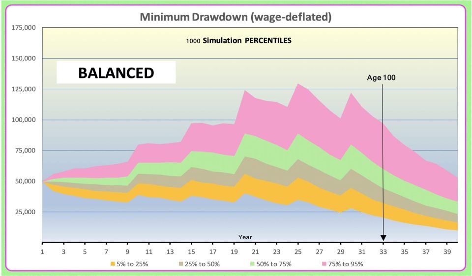
The illustrations do not include allowance for the Age Pension but that should not detract from the general conclusions.
Better than the Minimum
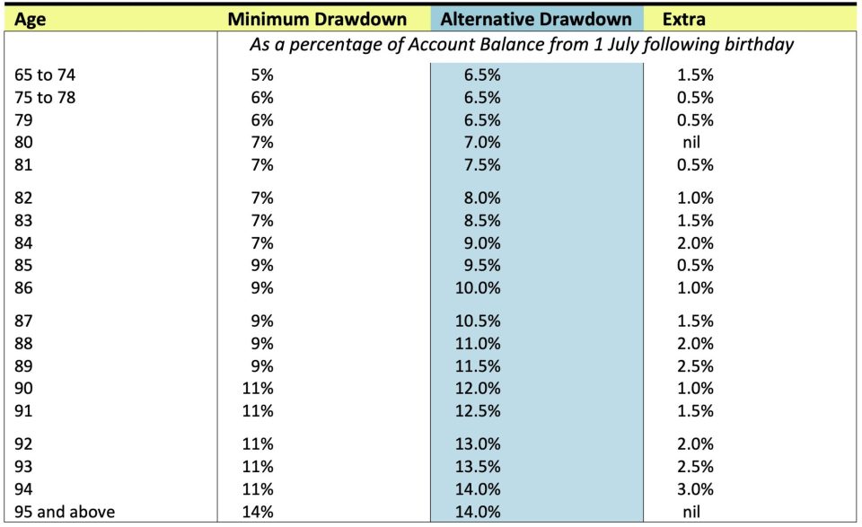
The above is based on the following age-based Minimum Drawdown rules. To improve payments in the early years, often associated with ‘active’ retirement, and to give a smoother payment pattern in later years, the balance of this article will be based on the ‘Alternative’ payments shaded blue in Table 1 below. Compared with the Institute’s ‘Draw your decennial age ‘rule of thumb’, the alternative payments commence at a higher level (based on a 6.5% drawdown rather than 6%). Also, the ‘rule of thumb’ follows the “Minimum Drawdown” jagged path after age 79.
Table 1
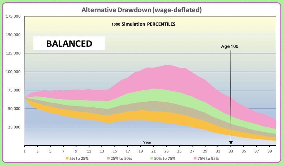
Using the same ‘Balanced’ portfolio as in Chart 1 above, the alternative allocated pension drawdowns (wage-deflated) are illustrated in Chart 2 below.
Chart 2
Widen your Horizons
The first challenge with Chart 2 above is that 10% of the full potential outcomes are not illustrated. In some retirement income percentile charts this is exacerbated when charts do not illustrate up to 20% of the full distribution. These charts show only the distribution from the 10% percentile to the 90% percentile.
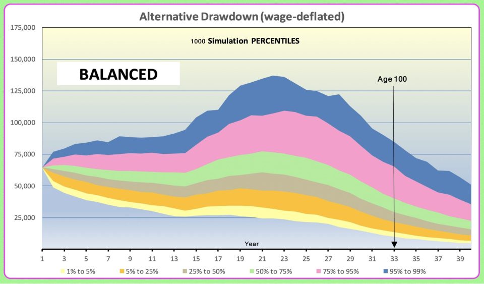
If, instead of showing the distribution from the 5% percentile to the 95% percentile (as in Chart 2), we widen the horizon to 1% to 99% we get the result in Chart 3. Now only 2% (equivalent to a one in 50 event) of the full distribution is not illustrated. This article is based on the stochastic investment assumptions explained in my August 2021 ‘Summit’ paper (refer below). Those assumptions allow for tail distributions based on 248 years of experience (62 years at quarterly intervals). That should be adequate to have reasonable confidence to illustrate tail distributions beyond a one in 50 event.
Chart 3
The Path is not Smooth
The second challenge with all the above charts is that a non-technical client will misinterpret the smooth percentile paths as being scenario paths. It is the latter which indicate what might happen to an individual. I believe that this is important information that anyone choosing investment products or strategies or planning allocated pension drawdowns (or even considering market-linked annuities) should have. One way to illustrate this is to chart say eight “spider trails” based on eight different scenarios – however such charts are sometimes cluttered with overlaps and difficult to interpret.
Since the percentile chart can act as a backdrop to show say 98% of the distribution, I suggest that an even better way to resolve this problem is to add at least one scenario to Chart 3. In the following chart the 1000th scenario has been added.
Chart 4

The Outcome may be Lower
Even better, consider the following which also includes the 999th scenario. Note that the two scenarios follow a similar path for four years, and are almost equal at 19 and 25 years, but then they deviate significantly. The key message is that even if the final outcome is say second or third quartile, it is most likely that the full journey will encounter some times in the first or fourth quartiles.
Chart 5
Cover Prices and forget Living Standards
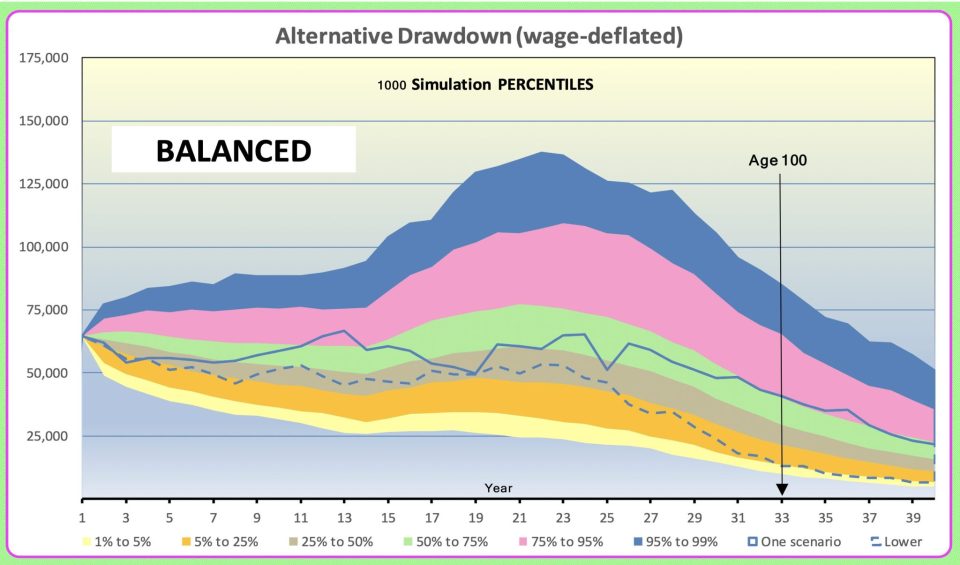
All the above charts are based on wage deflated dollars. The Actuaries Institute Practice Guideline 499.02 explains that:
‘Wage-adjusted dollars’ converts your future retirement assets or income into today’s relative buying power. It takes the future dollar amount and discounts (or deflates) it at the rate of wage inflation. Wages, salaries and community living standards have tended to grow faster than prices, and converting to ‘wage-adjusted dollars’ means you can better decide if your future retirement assets or income will be adequate compared to your current standard of living.
This would seem to be appropriate for any retiree, myself included, who wants to continue, until death, with a living standard commensurate with that enjoyed by their children and grandchildren.
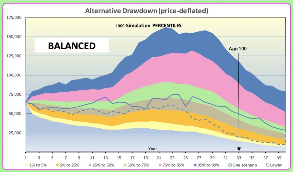
But, if the client is willing to suffer a decline in living standards (relative to the community) and only wants a price-based deflator for benchmarking, we get the outcomes illustrated in Chart 6 below. Note that the distribution is now much wider. If the Age Pension were included the distribution might be narrowed because in some ranges the means test would act to dampen investment fluctuations.
Chart 6
Maybe consider going Defensive
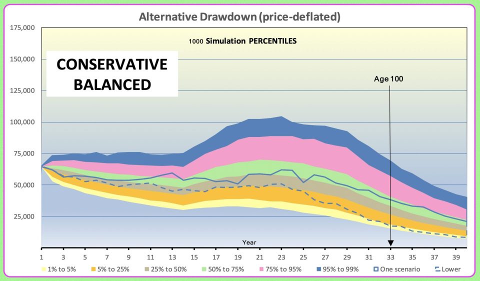
Chart 7 below illustrates what might happen if, rather than a ‘Balanced’ portfolio, a ‘Conservative Balanced’ investment strategy is chosen. For this purpose, I have used a strategy exactly half-way between the ‘Balanced’ portfolio and the ‘Capital Stable’ portfolios described on page 32 of my August 2021 ‘Summit’ paper. This ‘Conservative Balanced’ strategy comprises 50% growth assets and 50% defensive. It shows a much narrower range of outcomes, with lower levels of income in simulations other than those with poor investment returns.
Chart 7
In 2019 the Institute wrote to software firms that financial planners use. The worked examples in the Institute letter indicate that:
‘Age 100′ (i.e. 65 + 35) might be an appropriate planning horizon, if allowance is made for ’25 year’ improvements, for a married couple to be 80% confident that their income will last until the “second death”:
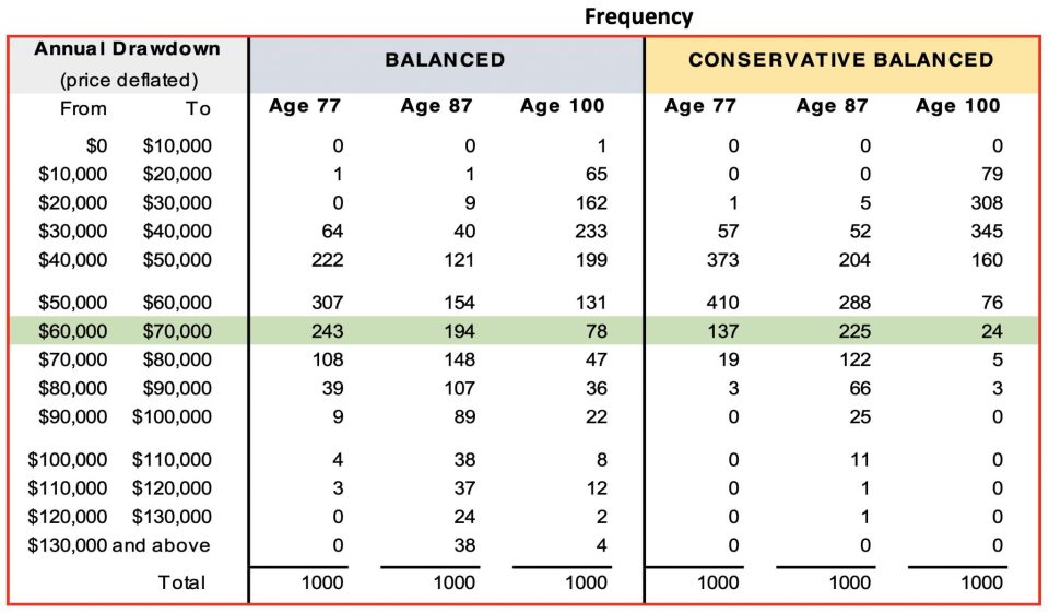
Based on this conclusion it would be helpful to conclude with a table illustrating the distributions of the ‘alternative’ drawdowns at say ages 77, 87 and 100. The frequencies for each of these ages are shown in Table 2 below on a price-deflated basis. The initial drawdown level is highlighted in green.
Table 2
What’s under the Bonnet?
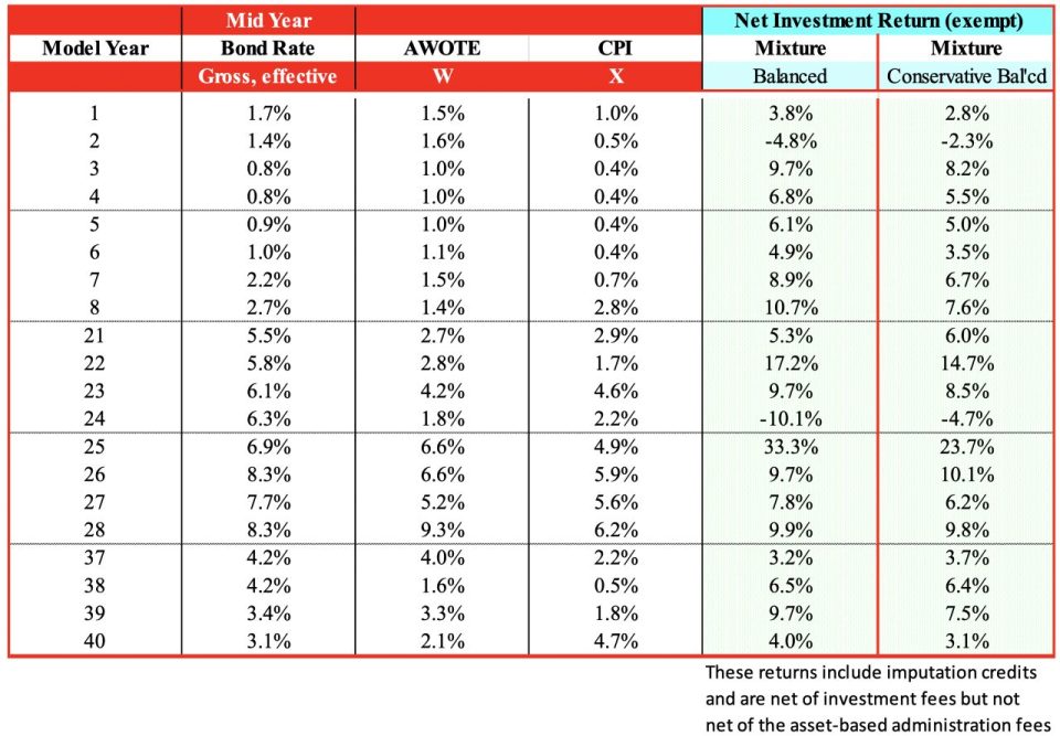
All the above have been derived using my Austmod Investment Simulation Model and the assumptions described on pages 63, 64 and 66 of my August 2021 ‘Summit’ paper ‘Australian Investment Performance 1959 to 2021 (and Investment Assumptions for Stochastic Models)’ except for:
- the inclusion of an allowance for administration costs of 0.125% of assets p.a. and,
- to reflect “current conditions”, all projections allow for a 48-year “bumpy” cycle in ten-year Bond Rates and commence at a fixed three years prior an assumed low point (as explained on pages 15, 78 and 79 of my ‘Summit’ paper).
The following table gives an abridged overview of a typical scenario from the projections.
Table 3
Interested in more thought leadership on retirement income?
Check out our below thought leadership publications
 |
 |
 |
 |
 |
 |
 |
 |
CPD: Actuaries Institute Members can claim two CPD points for every hour of reading articles on Actuaries Digital.


