Status Update of the Coronavirus (COVID-19) Outbreak
Three weeks ago, Zeming Yu explored the development of confirmed cases and death rates across the globe using the data visualisation software Tableau. What has changed over the last three weeks? Let’s find out.
China vs the rest of the world
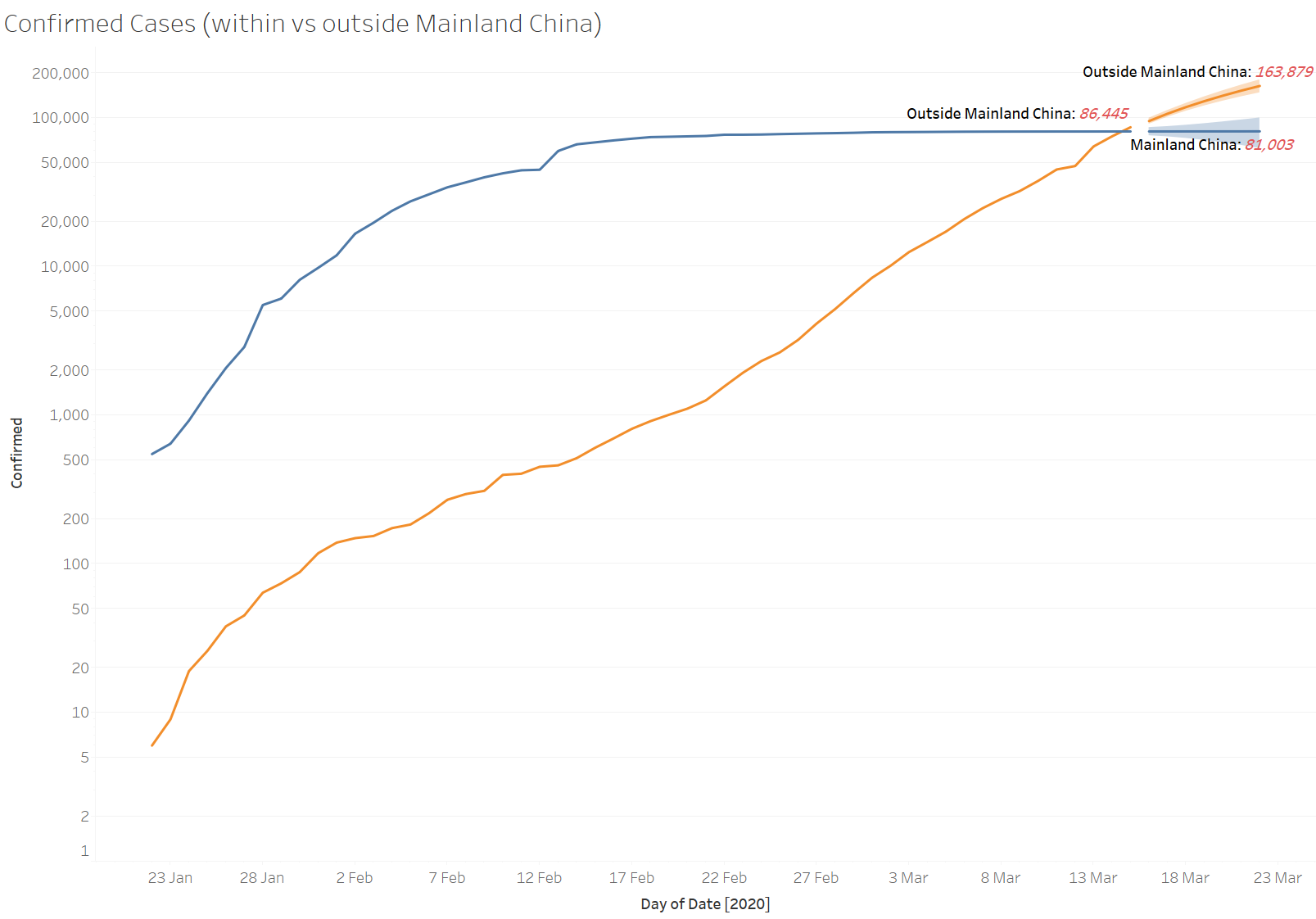
15 March marks the first time that the confirmed cases outside Mainland China surpass Mainland China.
The number of confirmed cases in Mainland China has not grown much since mid-February. This is no surprise given the vast number of cities undergoing strict quarantine. To understand the scale of this quarantine, please read my previous article.
In contrast, the growth in confirmed cases outside Mainland China has increased a lot.

Growth in confirmed cases — Mainland China vs the rest of the world
What will happen in the next 10 days? Tableau’s analytics features allow you to put a forecast (probably oversimplified) in the chart with a few clicks.
But just because it’s quite simple to do, should you do it?
The danger of extrapolation
3 weeks ago I did a similar projection for the number of cases as of 9 March (which was 10 days ahead of the available data back then).
The forecast did reasonably well for Mainland China but failed miserably outside Mainland China.

This illustrates the danger of extrapolating past experience into the future — especially at the early stages of development. While software like Tableau makes it really easy to produce a forecast number, we need to think carefully about when NOT to use it.
Four countries, different trajectories
Three weeks ago, South Korea, Italy, and Iran were experiencing some of the fastest growth rates.
This is what I wrote three weeks ago:
- Singapore is doing amazingly well. Due to its unique circumstances, other countries may not be able to replicate its strategies.
- Japan also seems to be doing OK. It has issued guidelines on when to go to the hospital. This helps to avoid flooding the hospitals and also reduces the further spread of the virus within the hospitals.

Revisiting the numbers today, we can see that
- Singapore and Japan continue to perform quite well.
- South Korea had massive growth initially but the growth is now slowing down.
- Italy and Iran are still quite concerning
It is interesting to see the growth rates in Japan and Italy diverge, despite both countries having a very old population.
A global pandemic
On 12 March, WHO announced the COVID-19 outbreak a pandemic. It is no longer confined to China and a few countries.
To understand that it is indeed a global issue now, just compare the graph below with the same graph three weeks ago. See how much more crowded it has become!


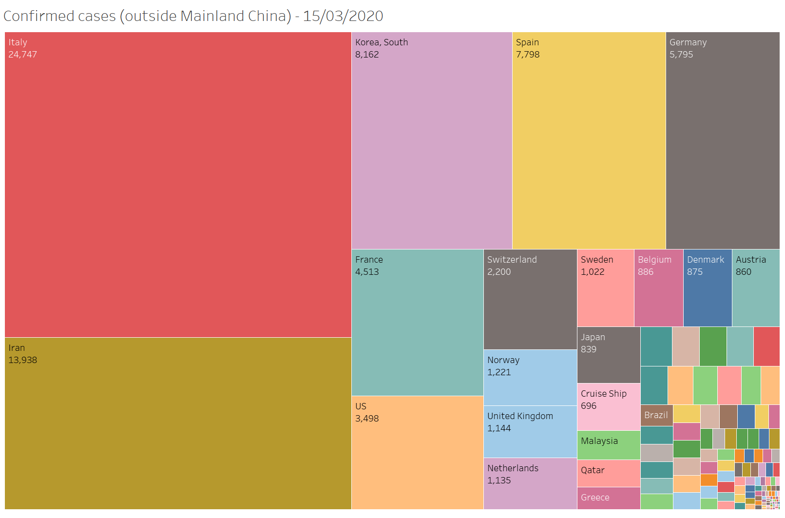
European countries are now at the forefront of this global battle. In addition to Italy, many countries such as Spain, Germany, France, and Switzerland are also experiencing exponential growth right now.

It is interesting to see the three European countries — Spain, Germany, and France following the same trajectory at almost the same time. Based on this simplistic graph, Australia seems to be less than 2 weeks away from where these European countries are today, i.e. having 5–8 thousand confirmed cases.

China

The confirmed cases for all regions within China are not growing much at all.
People are finally returning to work. Shops are opening. You can see traffic jams again on the streets of Beijing!
The focus has now shifted towards making sure people entering China are restricted and quarantined properly for 14 days. Without restricting inward traffic, China may experience a second phase of virus spread.
Some people joke that right now Wuhan is probably the safest place on earth to hide away from the virus because:
- its borders remain closed
- the entire city has been under quarantine for 7 weeks
- the number of new cases is heading towards zero
- there was a massive increase in the supply of hospital beds after building two new hospitals at breakneck speed (see the video clip below)
Hopefully, the virus will be well controlled within China by late April, as predicted by Dr. Zhong, who is director of the National Clinical Research Centre for Respiratory Disease.
Death rate
Last time, the death rate of China was significantly higher than the rest of the world.
Three weeks on, the death rate outside Mainland China has seen a massive increase since 9 March, from 2% to 3.5%, significantly closing the gap.

This is partially driven by Italy, which currently has one of the highest death rates worldwide. An older population and the lack of tests for milder cases are believed to explain this phenomenon.

Animation
Finally, let’s have a look at an animation showing the growth in the number of confirmed cases worldwide.

Technical note:
- I have used Tableau to produce these graphs. I find it very useful for exploratory data analysis.
- The data was obtained from here which is in turn obtained from here.
- Data as at 15 March 2020.
See Zeming’s original article posted here.
CPD: Actuaries Institute Members can claim two CPD points for every hour of reading articles on Actuaries Digital.


