Where’s the data on Australia’s COVID-19 vaccine rollout?
Three months into the vaccine rollout, publicly available data on vaccine uptake in Australia remains rudimentary and sporadic. This is in stark contrast to many other wealthy countries, where transparency has been key. We argue that better information could help all stakeholders understand what’s going right and what’s going wrong, and home in on the interventions most likely to make the biggest difference.
This article was inspired by a blog post published Jennifer Lang on actuarialeye.
In the same way that it seemed everybody wanted to do analysis of the number of COVID-19 cases earlier in the pandemic, many of us now want to do interesting analysis of who is getting vaccinated in Australia. But we can’t. Why not? Because unlike every other rich country we have Googled, very little data is publicly available.
Anthony Macali, who maintains a very comprehensive statistics site on all things COVID-19 in Australia, is doing his best. Back in March 2021, when Australian vaccinations were just starting, Macali tweeted a simple request for data:
- doses administered;
- people fully vaccinated; and,
- doses allocated.
Three months into the vaccine rollout, rudimentary information on two of these three is available, but finding information on people fully vaccinated remains surprisingly difficult.
So what information is currently provided (as at 20 June)?
Doses administered
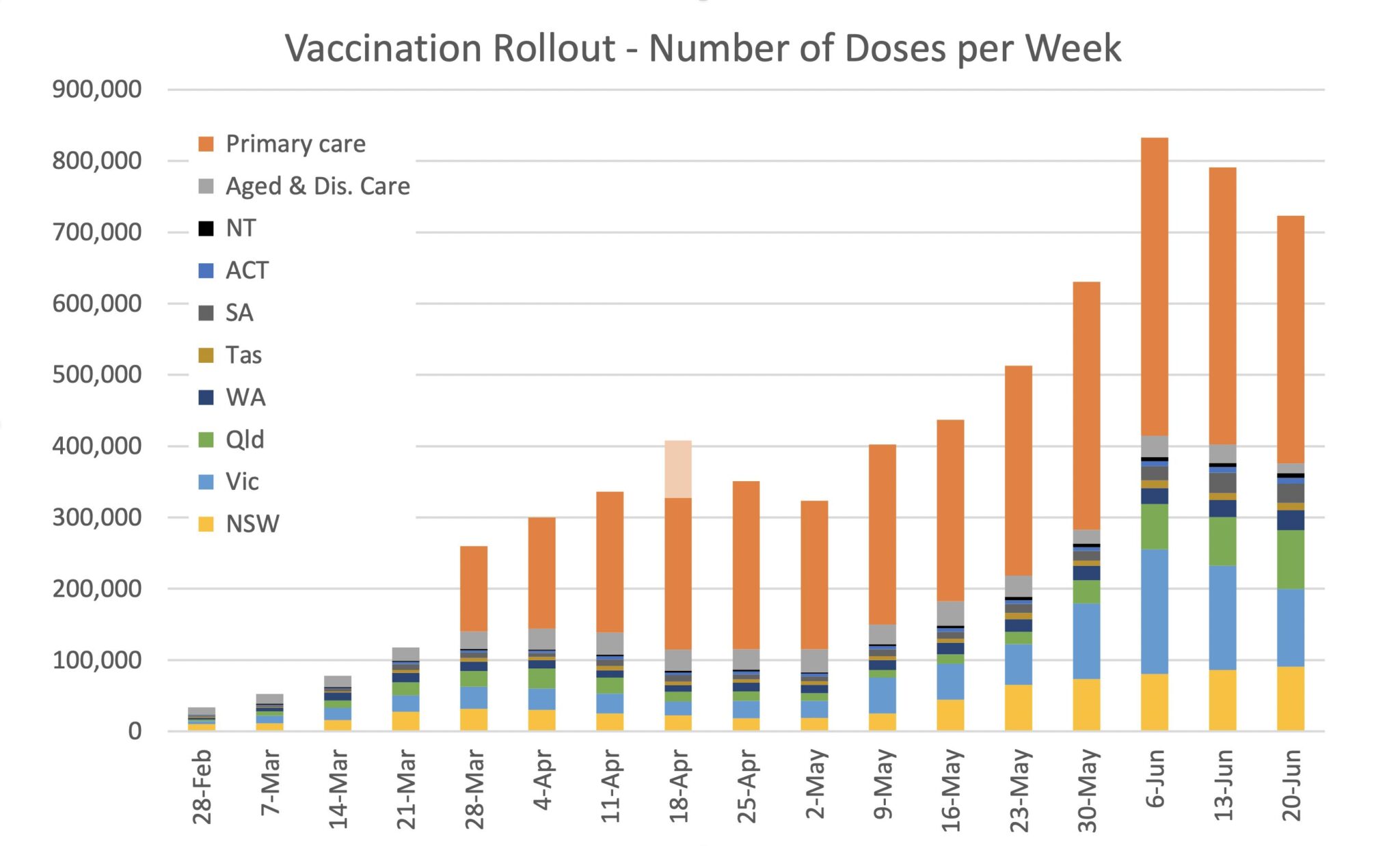
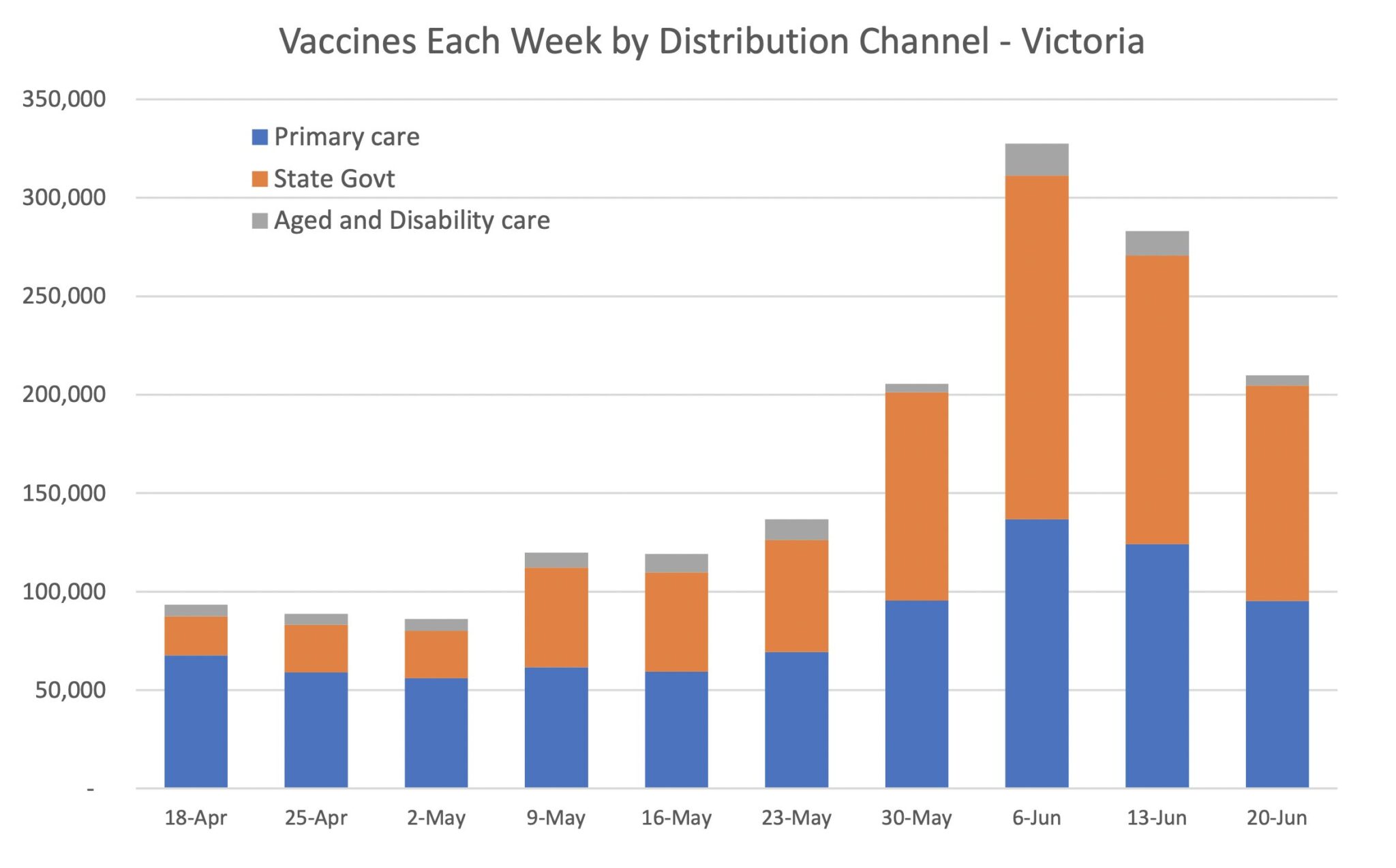
The Federal Government publishes daily statistics on the number of vaccine doses administered, broken down by distribution channel, namely:
- state and territory clinics (with data shown for each state/territory);
- Federally administered doses in aged and disability care facilities (in total, and by state/territory); and,
- primary care i.e. GPs, Commonwealth vaccination clinics, Aboriginal Community Controlled Health Centres, pharmacies (in total, and by state/territory).
First versus second doses are provided for aged and disability care facilities only, noting that these doses make up about 7% of doses administered to date.
From this data, we can compile weekly (or daily, or cumulative) graphs along the following lines:


Doses allocated
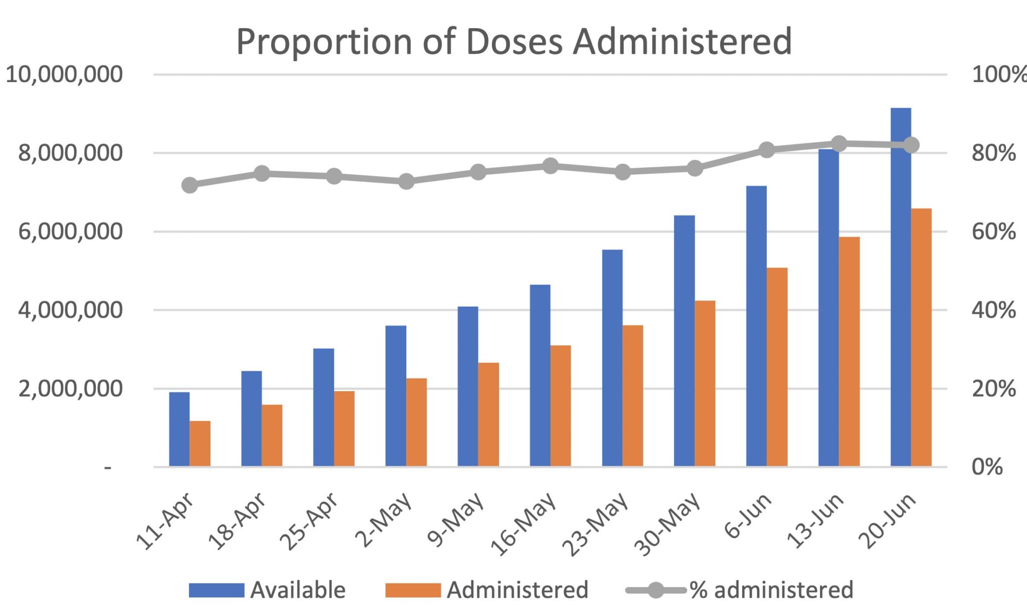
On a weekly basis, the Federal Government provides information on doses distributed (including planned deliveries for the coming week), doses available (being those actually delivered at the start of the week) and doses administered. The data is provided for each distribution channel, but without any breakdown by vaccine type, or by state/territory for aged/disability care facilities or primary care. This data enables graphs like this to be compiled, noting the percentage administered includes allowance for 10% wastage (the Australian total is shown, but the same can be produced for each distribution channel):

People fully vaccinated
If you wanted to know how many people were vaccinated in your home state, there is almost no chance you would find that information easily – the data is piecemeal and incomplete. Very little information is publicly available on the number of first versus second doses, or in the Government’s parlance, those ‘vaccinated’ versus those ‘fully vaccinated’.
The total number of people fully vaccinated across Australia is mentioned approximately weekly (but not consistently) in press conferences. It is not routinely reported on in a publicly accessible website or database. There is data on some groups for first versus second doses such as:
- the Commonwealth for aged and disability care residents (as noted above);
- New South Wales and Victoria, for doses administered by the state government only; and
- Northern Territory and Western Australia, for total doses administered in the state (regardless of distribution channel).
Queensland, South Australia, Australian Capital Territory and Tasmania do not publicly report any information on first versus second doses at all. Interestingly, the Western Australian Government publishes a graph weekly that shows the proportion of people fully vaccinated in each state (expressed as a percentage of population aged over 16). We’re not sure that the 90% of Australians that live outside of Western Australia would be aware that this is their most valuable, consistent data source!
Demographic profile of people vaccinated
There is very little information available on the proportion of people vaccinated in each age band. Again, this is quoted sporadically in the press, but information is sparse and inexact e.g. “x% of people aged over 70 have been vaccinated and y% of people aged over 50 have been vaccinated”. Presumably “vaccinated” equals at least one dose, and “over 70” includes those aged 70? Sometimes Australia-wide figures are quoted, sometimes for Victoria only, and at other times it is unclear which.
In terms of other demographic profile data:
- No information is available on the number or proportion of people vaccinated by eligibility priority group. It is apparent from questions raised in Senate Estimates that data on the number of aged and disability care workers vaccinated is only just now being collected. It is unclear if the information for other priority occupations such as hotel quarantine or health care workers exists.
- There is no reporting at all on the proportion of people vaccinated by gender, geographic area, Aboriginal or Torres Strait Islander/non-indigenous, English as second language/not, all of which are available on the Australian Immunisation Register.
How do other countries fare?
The United Kingdom’s Government has an interactive dashboard, updated daily, with some great information on first and second doses – here is just one example:
All data behind the graphs is available for download, enabling analysts to design their own graphs such as this very visually pleasing one:
Public Health England (PHE), as part of their weekly Vaccine Surveillance Report, produces this graph for both first and second doses:
And for those who want to delve even deeper, very granular data is published weekly, including by dose, age, ethnicity, local authority, two types of care homes (residents and staff separately), health care workers, and at risk individuals and carers.
In the United States, the CDC site allows you to play around with different graphs by region, age, ethnic background – here is a fairly basic graph showing the percentage of each age category who have been vaccinated with at least one dose:
Similar data could be made available for Australia – every vaccine dose is linked to a person through their Medicare number and uploaded to the Australian Immunisation Register. You can see your vaccination in your own My Health Record, accessible through the MyGov website. That means there is a national source of data which at the very least could identify who has had one or two doses of which vaccines, and subdivided age, gender and geographic location.
Why does it matter?
Tim Harford, an economic author, has an important rule about numbers (one of his 10 rules of how to make the world add up): Don’t take statistical bedrock for granted.
It’s possible to lie and obfuscate with numbers, but can you imagine making tough decisions without data? … The statistics are quietly and carefully assembled and we take them for granted. We just assume they will always be there when we need them. We notice only when something goes wrong.”
Concerningly, both the Federal Minister for Health and the Acting Prime Minister have at times overstated the extent of vaccine roll-out by confusing the number of people vaccinated with the number of doses administered. If we aren’t discussing even the right basic information about vaccine take-up, how can we possibly know what is working and what isn’t?
How can we target interventions that increase uptake in different age groups, ethnicities, geographies if we don’t know which groups we need to target? And how can we all think about the much larger question of state and international border closures and plan for a ‘post-vaccine future’ without clarity on who has been vaccinated?
It’s a cliché, but what gets measured gets done. And if we measure where and which people are being vaccinated, we can work out where it is not happening and fix it. The more granular our information about vaccination rates (age, ethnic background, location down to postcode level, aged care workers etc) the more everyone can understand what needs to change to make it faster.
In addition, a lack of a ‘source of truth’ in terms of the data means that much of the national conversation is about working out what the numbers are (“how many people have been vaccinated? Is that one dose or two?”), rather than focussing on what the numbers mean for the success (or otherwise) or the rollout.
We don’t know really know why more data is not being shared, other than it was “a decision of National Cabinet”. We note that on 21 June Lieutenant Frewen said that he was “working to make detail available”, but the timing and exact nature of this detail remains unclear. It is a problem because if we (i.e. the government, and those in the media and the public holding the government to account) aren’t measuring and sharing vaccine take-up, we don’t know what is working and what isn’t.
Why aren’t more people getting vaccinated?
As well as information on how many people have been vaccinated, we need more data on why people aren’t getting vaccinated. We each have some theories about who is and isn’t taking up vaccines right now and why we are slower than most of the world. So do most of the people we talk to. None of us have any idea beyond anecdote whether we are right. And without understanding what is going right and what is going wrong, it is pretty hard to fix it.
Commentators routinely assume ‘vaccine hesitancy’ is the cause, but there are many other factors at play. The US-based Community Guide and the globally recognised Cochrane Network have both undertaken systematic reviews of interventions to increase vaccine uptake. They include:
- making vaccines free and services convenient;
- reminders when a vaccine is due;
- default appointments;
- performance monitoring and feedback;
- on-site vaccination; and,
- standing orders, incentives and requirements.
These are the same interventions that The Fred Hollows Foundation – who Kirsten worked with for six years – uses successfully to increase uptake of cataract surgery. They are well evidenced and they work.
Education (including media campaigns) can work in some circumstances to inform and motivate people about new vaccines, but it is far from the only intervention available, and not necessarily the most important.
Which of these factors is most important in Australia right now? Good question. The more information we have about who is vaccinated and who isn’t, the more we can home in on the interventions most likely to make the biggest difference. Or even better, interventions can be tweaked in one state and the outcome in vaccination rates can be measured to see what works.
It is not a coincidence that the UK, one of the most comprehensive vaccination rollouts in the world, also has excellent data. Australia should have the same.
CPD: Actuaries Institute Members can claim two CPD points for every hour of reading articles on Actuaries Digital.


